Difference between revisions of "Forum:Colors in the Wiki"
Steve98052 (talk | contribs) (→Sunbursts (Sept 2019): Agreed, proposed style point.) |
|||
| Line 254: | Line 254: | ||
It's easier for us to deal with JPG, Steve. | It's easier for us to deal with JPG, Steve. | ||
: - [[User:Maksim-Smelchak|Maksim-Smelchak]] ([[User talk:Maksim-Smelchak|talk]]) 22:00, 14 September 2019 (EDT) | : - [[User:Maksim-Smelchak|Maksim-Smelchak]] ([[User talk:Maksim-Smelchak|talk]]) 22:00, 14 September 2019 (EDT) | ||
| + | |||
| + | ---- | ||
| + | That makes sense. On the other hand, it's probably best practice to recommend that vector illustrations be composed on vector format, and rasterized manually for the site. Then store the SVG somewhere for the time when it makes sense to enable SVG for direct use. | ||
| + | |||
| + | Would that be too obvious an idea to mention in the Manual of Style? | ||
| + | : — [[User:Steve98052|Steve98052]] ([[User talk:Steve98052|talk]]) 23:54, 14 September 2019 (EDT) | ||
Revision as of 03:54, 15 September 2019
Initial Pitch (July-2019)
So a few months ago User:WHULorigan noted that the use of the Red sunburst had proliferated everywhere.
Since then it has been replaced with the navy sunburst, but to a similar effect. It is just used everywhere. So I thought it would be more interesting to have a set of colors to use in different types of articles in the wiki. A short hand to indicate type. The sunbursts are used in the Infoboxes when there are no other images available and as a substitute for articles where we don't have a infobox to begin with.
 - Red (#DB143C) - IISS, Science, Technology, Education, Computers, Ancients, measurements, metrics, astrography, etc.
 - Orange (#FF6E32) - Culture, languages, customs, laws, history, Imperial Calendar, libation, victual, art, sport, etc.
 - Yellow (#FFF200) - Imperial Navy, Starships, Fleets, Ship Equipment, etc.
 - Green (#56B357) - Life forms, sophonts, creatures, beasts, plants, etc.
 - Blue (#2929CC) - People, personages, governments, noble house, Imperial Currency, organizations, corporations, VIPs, etc.
 - Black (#000) - Imperial Army, Equipment, vehicles, weapons, goods, Gear, war, history, manufacturing, industry, etc.
 - Grey (#99998A) - Metadata, errata, publishing background, bibliography, ludography, etc.
 - Black w/yellow - Emperor, Royal Family, etc.
The idea would be to include these in the article as needed for placeholders. The Infobox colors for the different types would also be updated to match the color scheme so the sunbursts and the infobox colors were the same or similar.
Did I miss any colors or articles?
Brilliant idea. Nice touching up of the images as well.
- Are they all your artistry?
- How should we encourage you?
- Wayne had grey as well...
- And there is the black and yellow version... I believe the Royal Family and the Emperor.
- Base article with canon and non-canon: Imperial Sunburst
- - Maksim-Smelchak (talk) 14:47, 28 July 2019 (EDT)
- If we wanted to add grey, what articles would it encompass?
- Do you like the current organization? Are the grouping of articles correct?
- You wanted to add the Default wiki blue. Do you think we should have shades of these colors for each group, or leave the broader categories of articles?
- Are there other categories or groups of articles which should be included?
- Tjoneslo (talk) 18:30, 28 July 2019 (EDT)
I think we should wait for Wayne to respond.
- What is the difference between army and marines?
- It looks good. I have color notes somewhere else. Will find an post them.
- We also have the secret clearances from AOTI: Priority Classification
- Weren't there colors associated with them?
- I don't know about correct, because we're breaking new ground here, not canon.
- However, it looks good.
- - Maksim-Smelchak (talk) 20:55, 28 July 2019 (EDT)
I would still suggest there be a "default" color for articles that do not neatly fit into any of the categories above (or for those which are unclear and/or potentially "multi-category" - at least until an appropriate category and/or color is defined). My suggestion would be the Grey Sunburst listed above, and make the "Grey - Metadata, background, ludography" category actually a half-size grey sunburst, since those articles are about the game and/or the wiki, instead of being "proper" AAB articles. Alternatively, use the WikiNavy Sunburst at half-size for Metadata/background/ludography artciles.
Regarding Army vs. Marines: Articles go under Army (Black) unless specifically associated with Marines (Maroon). Army is general and encompasses not only Imperial Army proper, but also various Planetary Military Forces from which Imperial Army Regiments are raised. Marines are a small but elite and strictly Imperial Force.
But I like TJoneslo's idea.
- --WHULorigan (talk) 07:29, 29 July 2019 (EDT)
- This is a recommendation for using color as an organizational and categorization of the articles in the wiki. The fact that the colors overlap with some of the colors used for other aspects of Traveller is entirely coincidence. I thought about using pastels or neon colors for these, but Traveller really isn't a pastel or neon kind of universe.
- We should select either black or grey as the color for the metadata and ludography and remove the other one.
- I really don't want to add colors or designs to the list with "TBD" assigned. I'm perfectly willing to accept the idea I've missed something, which is why I'm asking now. If we come up with something missed in the future I'm quite sure we can add it, but I don't want to add things to the list just to have more colors.
- The size of the list should be driven by the categorization. I have seven groups of related articles, to which I've assigned colors. And that's the order in which we should do things.
- Based upon the notes above you don't have serious objections to the groupings.
- I selected seven categories originally because it's the upper limit to the ideal number of items in a list. There is cognitive research showing that the upper limit of the number of items a person can keep in their short term memory is around seven (some more, some less). Tjoneslo (talk) 07:52, 29 July 2019 (EDT)
- Two other points. This doesn't preclude using better images for the article where they exist. For example, the David Deitrick image used for some of the astrogation articles. Of the Maroon starburst for the actual Imperial Marine article.
- I think the question ends up being Black or Maroon for the Goods and Black or Grey for the Metadata. Tjoneslo (talk) 07:59, 29 July 2019 (EDT)
- Then Black for Goods and Grey for Metadata.
- --WHULorigan (talk) 08:06, 29 July 2019 (EDT)
What is the difference between the army (black) and marines (maroon) functionally?
- The conventional color spectrum is ROYGBIV...
- We don't have the IV or Indigo and Violet...
- Grey for metadata seems very logical.
- Black is army so all sorts of ground warfare equipment...
- Those are my opinions.
- 7 is a good cognitive number, but if we need more, we shouldn't use psych studies to guide us, but need. That's my subjective opinion. Retrofitting later is much more work.
- - Maksim-Smelchak (talk) 08:54, 29 July 2019 (EDT)
- I added the grey image for the metadata and Ludography. I'll start making changes to articles and templates shortly. Tjoneslo (talk) 23:25, 29 July 2019 (EDT)
Would you be willing to upgrade the grey and black-yellow images with the black outlines so they match the others?
- Please
- - Maksim-Smelchak (talk) 23:27, 29 July 2019 (EDT)
Thanks.
- Mazel Tov on a great idea!
- - Maksim-Smelchak (talk) 08:21, 30 July 2019 (EDT)
Later Pitch & Application (August-2019)
There are two other sources of colors in the wiki:
- The Template:UWP uses different colors for the planetary Trade classifications, the code determining the background color of the title bar for the world name.
- The Allegiance Standard Colors defining colors for each of the major powers.
What about non-Imperial articles? Is there a generic (possibly non-sunburst) image we can use when talking about the navy or exploration (scout) service of some polity off in Crucis Margin? (Or Datsatl/Gakghang/Thaku Fung.) Or would it be better to simply not use an image for these articles?
This also appears to be a problem, at this moment, for the Aslan Hierate (generic Aslan, no symbol), Vargr Extents (party of Vargr - granted, the Extents is a collection of polities, but e.g. 40th Squadron uses Imperial sunburst), Two Thousand Worlds (Imperial sunburst), and arguably Hive Federation (has a symbol, could be better quality).
If you have or recommend a symbol we could use, I can do the colors for them. The T5 Font set has a symbol for the Zhodani (a trefoil symbol on their page). The Aslan have a four pointed star. I would rather not use the Skull for the Vargr, so a better one for that would be appreciated. One of them there for the Hiver (not the six pointed symbol from the back of Aliens of the Rim). And another for the K'kree. But the reference I have doesn't mention which is which.
- This was about using colors to identify the categories of articles so the symbols are not as important.
Adrian, there really isn't a standardization at Trav Map or here at Trav Wiki.
- Josh has discussed it, but I don't see consistency yet.
- It hasn't caught Marc's attention yet.
- There are basic color sets for the major races, but it breaks down after that: Allegiance Standard Colors
- The basic "national" symbols for each race are mostly set, but not concrete. Some major races have multiple symbols depending on the game version, and that is not fully settled yet. IT's on my list of long-term things to do.
Adrian, would you be willing to create some notes collecting all the different major and minor race symbols and colors over the years?
- Many of the sophont race POLITY pages already have some of this data.
- They are mostly listed as Polity Quick Facts.
- - Maksim-Smelchak (talk) 09:57, 1 August 2019 (EDT)
Having thought about this a bit:
- The point is to have a generic image, or set of generic images, for articles about minor polities, as the Imperial sunburst does not seem applicable to things that are defined in part by not being Imperial. That some non-Imperium major polity articles also suffer from this problem is a data point of interest, but does not change the issue to be just about the major polities (for which a full list of individual symbols could theoretically be found).
- Droyne coyns are an in-Traveller set that tries to provide symbols for every type of thing. Might those be useful? https://zhodani.space/goodies/coyn_chart.gif is one set, or we could make our own.
- Racial-type coyns might be useful for articles dealing with things primarily of one race, including but not limited to the major polities that do not (yet) have their own symbols.
- Caste-type coyns might cover many other what-sophonts-do types of things, such as Leader coyn for government articles and Technician coyn for technical articles (again, where there is not already some other image).
- Alternately, where
 is used for technical data, might some alternate to that apply to government articles? I notice that some of the images on this wiki appear to come from Classic Traveller. If we have permission to use those images, I see a couple (pages 41 & 43 (also appears on page 57) of Starter Set Book 1) that might stand for governments, and another couple (pages 32 & 42 of Starter Set Book 1) that might stand for IISS equivalents.
Atymes (talk) 03:29, 25 August 2019 (EDT)
T5 Symbology (2019)
- Technically, this is the "Imperial Encyclopedia" so using the imperial starburst seemed like a good starting point. The point made in the original pitch was that the starburst was to be used in places where no other image was available.
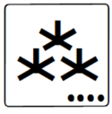
- Another source of Images we could use would be the T5 Symbols font that was shipped with the T5 CD-ROM (original). I uploaded a number of these to the wiki as the next stage of this project:
- * Zhodani -

- * Hiver -

- * K'kree -

- I really don't like the Hiver symbol, but haven't fixed it yet. The idea would be to use these symbols with the colors to indicate, for example, the Hiver equipment, or K'kree history, or the like. Tjoneslo (talk) 10:46, 25 August 2019 (EDT)
Tjoneslo, I love it Thomas.
- Please upload those.
- What do the dots mean on the symbol?
- I have set of Droyne Coyn images that I can upload.
- Adie and I have been working on it.
- - Maksim-Smelchak (talk) 11:04, 25 August 2019 (EDT)
- That's a really good question. I don't know what the dot's on the symbols are. They come that way in the Symbol font set. It's probably a good question to ask Marc or whomever built the Font. If you find out a real answers, please post it here so we all can be enlightened. Tjoneslo (talk) 14:10, 25 August 2019 (EDT)
Sure thing. He nd I have chatted about it before.
- I'll put it on my list for our next briefing.
- We need to start a vehicle discussion here at the forums if it hasn't been done already.
- I want to get robots and vehicles started soon.
- Would you please think about a similar system to TDES for robots and vehicles?
- Thank you, sir.
- - Maksim-Smelchak (talk) 15:02, 25 August 2019 (EDT)
Image Adjustment (August-2019)
Thomas, can you shrink the symbols down to a 200 pixel width. It's bit big now and I'm getting fan complaints about it.
- A 200 pixel width seems to work best for most users whether on phone, tablet, or PC.
- Also, the grey and emperor roundels could still use black outlining. I have other volunteers with those graphic skills if you are busy. I can do sizing, cropping, and minor image editing at this point, but I am not sure how to skillfully outline yet.
- I realize how crazy images are and how they can manifest in different ways.
- I really appreciate you taking the initiative on this and want to personal thank you.
- Thank you and mazel tov. Great work.
- - Maksim-Smelchak (talk) 10:02, 1 August 2019 (EDT)
- The Grey sunburst referenced above, but not the old grey one, has the black outline. It's hard to see at the 50 pixel size, but is very apparent at the full size. I'd like to leave the images at the size they are in the wiki and use the image size in the link to enlarge or shrink them as needed. E.g. [[File:Imperial-Sunburst-Sun-Scouts-wiki.png|250px]]. Let's let the computer do the work of sizing the images correctly.
- The infoboxes are sized assuming a 300px image. It's baked into the size of the box and the text layout. But for the non-infobox uses you want the smaller images? Tjoneslo (talk) 20:22, 1 August 2019 (EDT)
Ok.
- Infobox images displays better on many hand phones using the 200px width.
- - Maksim-Smelchak (talk) 21:38, 1 August 2019 (EDT)
- Interesting. Can you tell me how these infoboxs look on your phone. Screenshots would be best, but a description would be sufficient.
Looks fine.
- And I pull in input from a variety of users, not just my phone.
- - Maksim-Smelchak (talk) 09:23, 2 August 2019 (EDT)
- Since the Infoboxes presented as examples are all about the size of the Sunburst images, I'm not convinced the just the size is the problem. I think it's more that the image is a wall of color. Let me look at adding a gradient to the images, soften them somewhat, see if that looks better. Those were an hour of work to do the first one, and 10 minutes each for the others. Tjoneslo (talk) 09:33, 3 August 2019 (EDT)
They look nice.
- Would you please leave a hyperlink here to all of our sunburst images?
- Thank you for your hard work on the wiki.
- - Maksim-Smelchak (talk) 10:37, 3 August 2019 (EDT)
Sunbursts (Sept 2019)
In addition to the list above we have the following Sunburst images in the wiki:
 - File:Wiki Navy.png
 - File:Wiki Scouts.png
 - File:Sunburst (Black & Green)-3.jpg
 - File:Sunburst (Black & Green)-2.jpg
 - File:Sunburst (Black & Grey)-2.jpg
 - File:Sunburst (Black & Grey)-1.jpg
 - File:Sunburst (Regency).jpg
 - File:Sunburst (Black & White).png
 - File:Sunburst (Black & Green).jpg
 - File:Sunburst (Black & Creme).jpg
 - File:Imperial-Sunburst-Sun-Army-Traveller.jpg
 - File:Imperial-Sunburst-Sun-IISS-Traveller.jpg
 - File:Imperial-Sunburst-Sun-Navy-Traveller.jpg
 - File:Imperial Sunburst-Sun-IISS-Traveller.gif
 - File:Imperial-Sunburst-Sun-Marines-wiki.png
 - File:Imperial-Sunburst-Sun-Marines-Traveller.gif
 - File:Imperial Sunburst Marines Small.png
Thank you.
- - Maksim-Smelchak (talk) 16:29, 4 August 2019 (EDT)
Tjoneslo, do you plan to update the black and yellow Imperial image as well?
- Great work on the other images.
- - Maksim-Smelchak (talk) 23:40, 19 August 2019 (EDT)
I made my own SVG image of the sunburst for another project. I tried to replicate the 21-flame image I've seen in numerous publications. The band between the central circle and the flames runs between 63% and 70% of the size out to the extreme tips of the rings. I even tried to duplicate the shape of the flames. The SVG version has the advantage of being just over 7k, compared to about 60k for a PNG rasterization. It has the disadvantage of being not supported by this version of Mediawiki.
Here's a 50-pixel thumbnail of my 1000-pixel rasterization.  (But this small, it's hard to see much difference from any other version.)
I could share the SVG as a text file in my user space if there's an interest in it.
- — Steve98052 (talk) 20:00, 14 September 2019 (EDT)
Sure, Steve.
- - Maksim-Smelchak (talk) 20:40, 14 September 2019 (EDT)
It's easier for us to deal with JPG, Steve.
- - Maksim-Smelchak (talk) 22:00, 14 September 2019 (EDT)
That makes sense. On the other hand, it's probably best practice to recommend that vector illustrations be composed on vector format, and rasterized manually for the site. Then store the SVG somewhere for the time when it makes sense to enable SVG for direct use.
Would that be too obvious an idea to mention in the Manual of Style?
- — Steve98052 (talk) 23:54, 14 September 2019 (EDT)